Patient Flag Review
The current patient triage process was inefficient and disorganized, making it difficult for clinicians to systematically review and prioritize patient care needs.
JOBS TO BE DONE
First we created a workflow to show our understanding from our clinical SME's what jobs needed to be done, when they needed to be done, and who needed to do them. This helps us in the path of knowing when and where all the touch points are during a flag review process by our clinical team.

DESIGN EXPLORATION
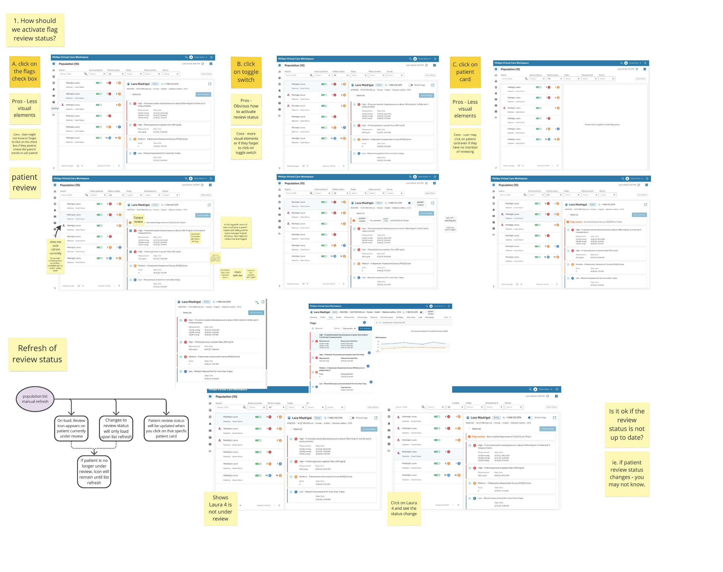
Next, lets take what we know to create a few quick concepts with the team. Here we can pinpoint what the workflow should be from an interaction perspective. Lets really figure what what the users will be doing while they are reviewing the flags so we can best create the space for optimal interactions.

DESIGN - PATIENT LIST
Now lets focus on the information a clinician needs to see. With our exploration with the SME's we know the clinicians rely on flag data from incoming measurements and surveys, coupled with what the patient has already completed today. We show these on the right of the patient list using color indicators to mark the incoming data at a glance.

DESIGN - REVIEW PANEL
Once our clinicians have a better understanding of the patient list they have on hand, we need a way to show them deeper information for an individual patient without interrupting their workflows. We introduced the patient flag review pane to gain quick access to patient data. In doing so, clinicians can best determine the course of action for individual patients.

DESIGN - PATIENT REVIEW
We reflect the review toggle while inside of the patient chart. This way, no matter where the clinician is within their workflow, they will have the ability to mark a patient for review. Also, if a patient has been marked for review by another clinician, we can show that information here so we know who has started the review and when.
